
corporate redesign of bartelt GmbH
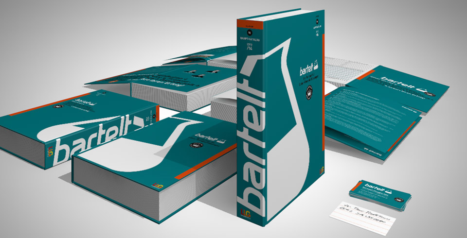
Revision of an outdated visual identity of bartelt GmbH, a provider of laboratory equipment.
Revision of an outdated visual identity.
For this European provider of laboratory equipment, a new visual identity was developed. Based on the cornerstones of the old identity, a professional and contemporary design was created. The new word mark underlines the high levels of expertise and service excellence of the company. The redesign tries to reapply the learned parts of the identity in order to retain brand recognition. This was achieved by keeping such elements as the bartelt turquois, the italic lower-case text as well as the Erlenmeyer flask from the old brand mark.


You may also like
Experimental Typography
Diesel »Fuel For Life« flacon reinterpretation
Illustration »Grazer Bike-Marathon Stattegg«
Folder lighting ceilings »Sofitel Vienna Stephansdom«
Fresh style for 2012 Bike-Marathon Graz / Austria
Distillery labels, Toni Grimm {Non-Profit}
Corporate Design, »Grazer Bike-Marathon Stattegg
Product folder »BIG.010 O«
Official Poster Competition; WM 2006
Small stationary set